II. What is Good for a City?
Efficiency & effectiveness measures
from financial impact to efficiency
Hi folks,
In our last post, we looked at the departments where Winnipeg spends the most money. This was the first step to figuring out (i) what we care about as a city, and (ii) the most likely places we could make a difference to the things that we care about as a city. As a reminder, the top three departments where the City spends money are:
- Public Works (the department responsible for infrastructure like roads, bridges, etc.),
- Transit, and
- The Winnipeg Police Service.
We ended up breaking it down into the next level of more specific spends. But, being a big number on the financials doesn’t necessarily tell us much about whether the processes generating that number can be optimized. To set the baseline, I’d like to look at how Winnipeg stacks up on delivery of these services by comparing it to other cities in these areas.
Fortunately, the Municipal Benchmarking Network Canada provides a good, and open, data source on just these kinds of measures. MBNC was originally created to track Ontario cities’ performance, but has since been expanded to other provinces and, luckily, Winnipeg is one of the cities that signed on.1
Here are some of the highest level descriptive statistics collected for the participating cities in 2018:
In order to have a baseline, let’s use these overview stats to find “similar” cities. First a quick “k-means” clustering.2 We would like somewhere between 3 and 6 comparables, so we should use between 3 and 6 groups.
After clustering each city’s yearly data, we get the following groups (which were pretty stable for Winnipeg’s cohort):
With 6 clusters (displayed), Winnipeg ended up grouped together with Hamilton, London, Regina, and Windsor in cluster 4. If we break it into 5 clusters, Calgary gets included in Winnipeg’s group.
This seems pretty plausible, but to validate, let’s try another method and see what we get.
Using a bottom-up hierarchical clustering analysis we get the following:3
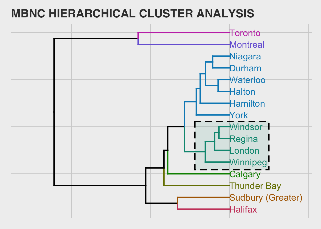
The results are pretty similar (which is good). This method groups Winnipeg with London, Regina and Windsor as comparables. Since this is a sub-grouping of the first method, we will keep these as comparables but keep an eye on Calgary and Hamilton as other possible comparables to baseline-set against.
general gov measures
Before hitting on the “big three” expenditure areas identified in the previous post, the MBNC data also takes a look at general municipal metrics that would be interesting for baseline-setting.
The first is the operating cost for governance & corporate management as a percent of total municipal operating cost.4 According to the MBNC, “This measure includes operating costs relating to Governance, i.e. Mayor, Council, Council support and election management; and costs related to Corporate Management, i.e. CAO/City Manager, finance, communication, legal, real estate, etc.” (p. 89).5
Across all relevant cities, Winnipeg is just below the median here: 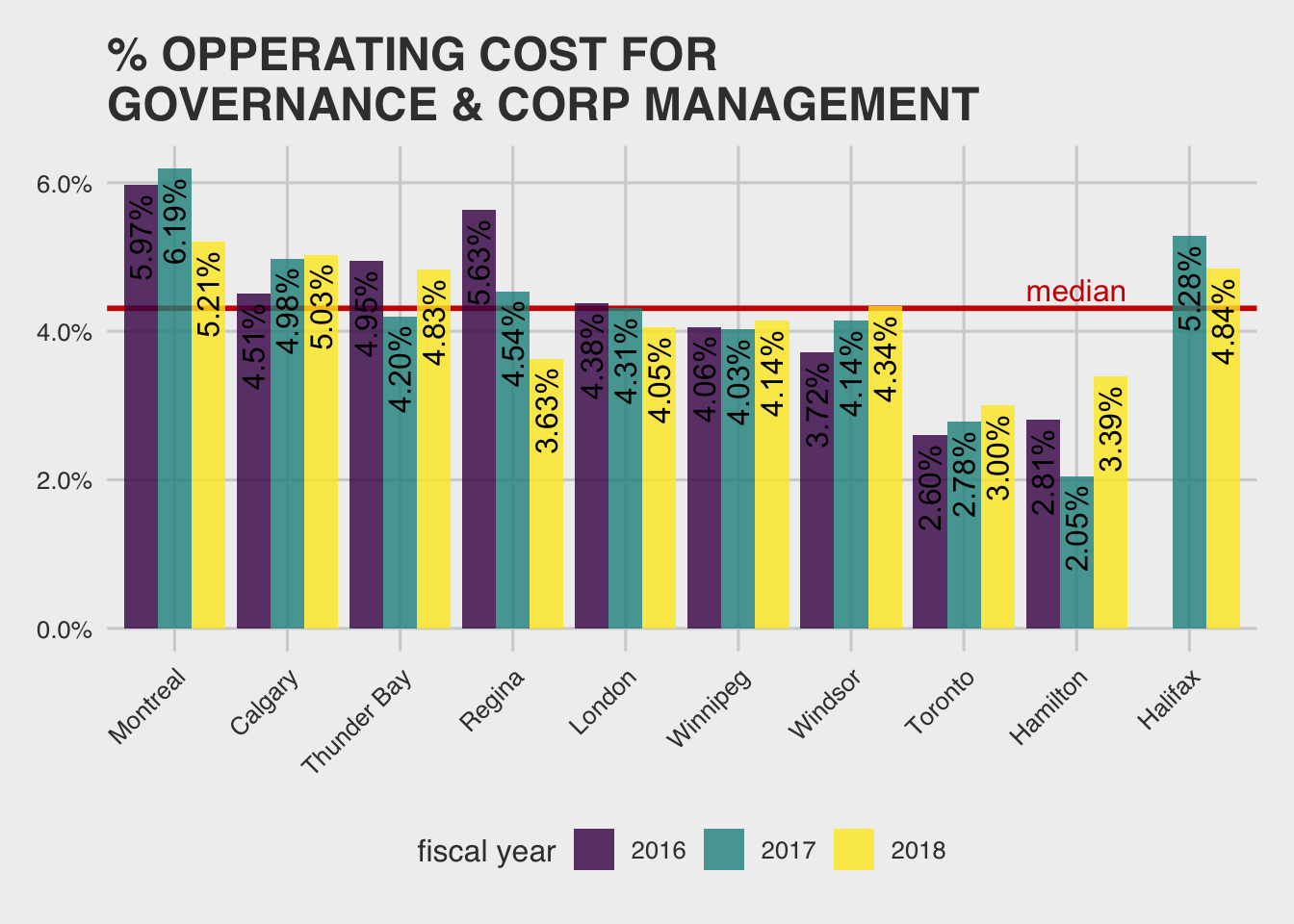
The result is similar if we look only at the closest comparables (moving right to the median if we include Hamilton, and back down if we include Calgary): 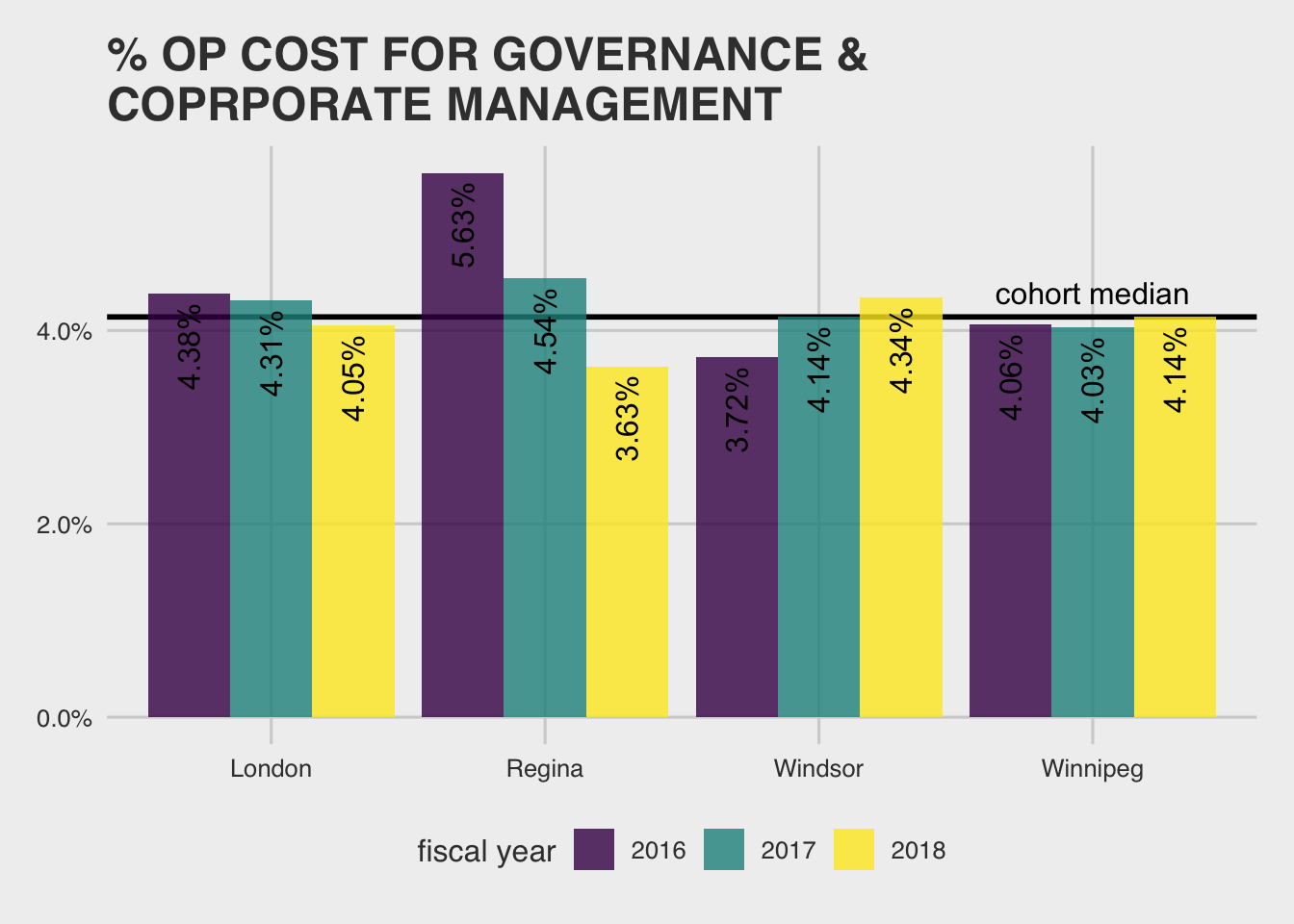
This seems good, but maybe expected since labor costs are pretty low in Winnipeg.
Another interesting general fact is that we have one of the highest city employee turnover rates out there: 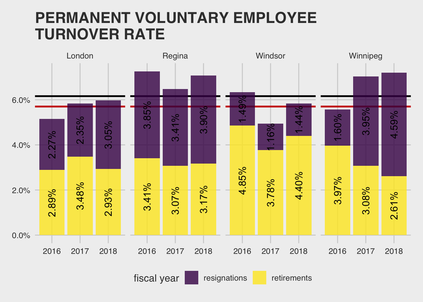
Again, Winnipeg would do better if we include Hamilton and worse if we include Calgary for a wash on the broader comparison. Notably, if you look at all municipalities, it looks like Winnipeg’s cohort members all do pretty bad for churn…the black line is the median within the cohort and the red line is median outside of cohort/overall.
Churn is a huge cost in business, since new employees tend to be initially inefficient, require time to train from those who are more efficient—thus making seasoned staff less efficient, and hiring talent is itself costly—you have to pay to advertise the job posting, someone has to writeand review the posting, hold interviews with senior staff, etc. It all adds up pretty quickly.
The graph also reveals a lot more.
Winnipeg has the highest in-cohort churn in 2018, it has been trending upward over the past three years. Yet, Winnipeg has one of the lowest retirement rates! This means that the churn Winnipeg is seeing is due to resignations. Presenting just the resignation data makes it even clearer:
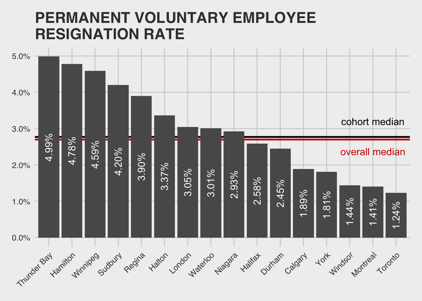
This is really surprising and a great “green field” data science insight. Churn due to resignation is controllable by human intervention. That it has been climbing/varies year over year, suggests it could be reversed. Plus, there are lots of ways to model churn and predict which factors influence it using familiar data science techniques.6 Because of the number of employees, it is potentially a huge area of opportunity.7
By some quick “back of the napkin” math:
- We have 9,118 employees (from the above data).
- Say new employees make $40k/yr and are only 70% efficient in their first 4 months—that’s a loss of $40k / 12 x 4 x (1 - .7) = $4 k/yr whenever a new employee has to take the place of an seasoned one.
- These employees also have to be trained. Lets ball-park assume that their trainers can only be 90% effective while training them, and that they make $60k/yr on average. By the same math, we lose an additional $2 k/yr.
- Then there is the cost of HR to write and post the job, screen, and interview. A friend in HR ball-parks this at $5,000 per employee.
Putting it all together, given that we have a resignation rate of 4.59% (ignoring retirements, which we will treat as non-controllable), we are losing 9,118 employees x 0.0495 x (4k new employee time + 2k seasoned employee time + 5k HR cost) = $5.0 M/yr to churn as a city each year.
Five million, not bad!
Realistically though, there are lots of cities performing around 1.5% resignation, so a $3M savings should be possible if this was targeted.
roads
Okay, on to the three areas highlighted by our financial analysis, starting with Public Works and roads.
Winnipeg’s roads are well-traveled:8
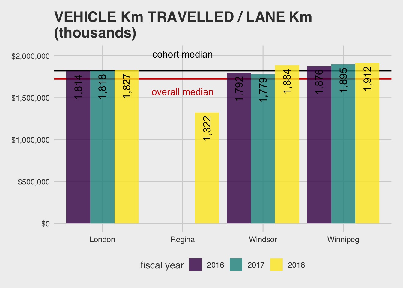
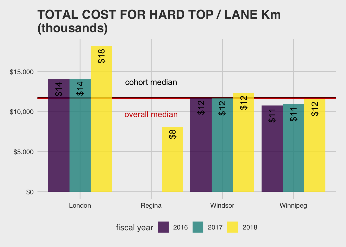
And we don’t spend a lot of money repairing them, compared to similar cities or overall:
What about when we factor in other things like snow removal, something other municipalities (Regina excluded) wouldn’t have to deal with to the same extent?:9
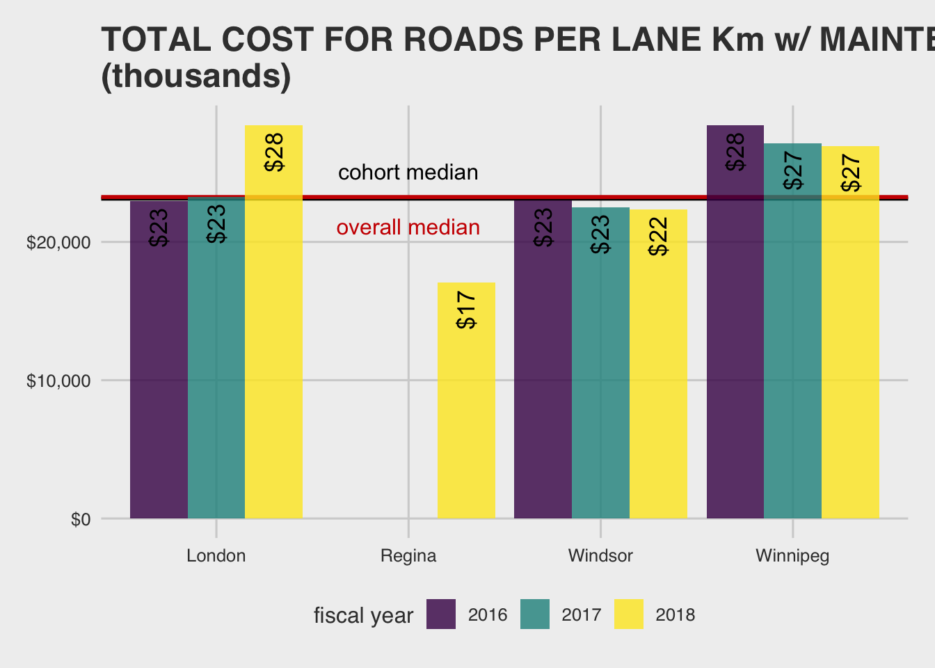
Here we spend a fair bit more.
That we spend more than Regina, and that it represents more of an increase ($15 vs $9), indicates that we are paying a lot for snow removal. Regina aside, snow removal has other implications too.
Both of the previous graphs include amortization, or how long we can spread the cost over at the going rate of interest. Since snow entails more wear and tear on roads, Winnipeg probably can’t amortize it’s roads as long, driving up cost. This should further accentuate how little Winnipeg spends on road repair in the first graph.
This goes some way to explaining the condition of our roads… along with the possibly benefiting from pretty cheap labor and material costs in Winnipeg and/or managing them well. Snow removal optimization could potentially be another interesting data science project to dig into. Tracking objects in space, and optimizing routes are not new GIS or data science problems. In fact, other cities like New York already seem to have this capacity (despite getting less snow). Unfortunately, I could not find any info on plow coordinates on the City’s website or open data.
Moving on, given that we seem pretty lean on road repair, but heavy on snow clearing, you would expect road condition assessment numbers to be bad right?
The MBNC data was a bit surprising here:
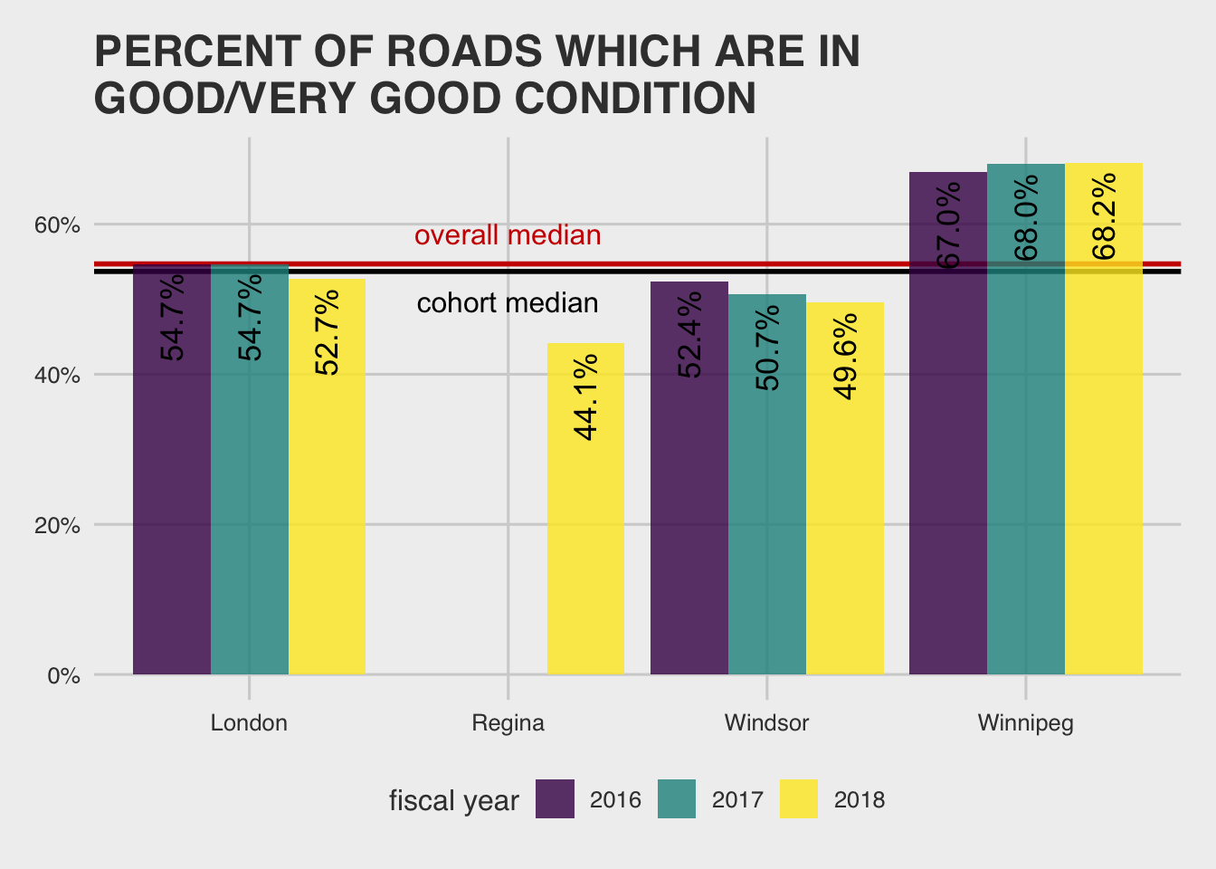
Umm…not quite what I would have expected. Are we even measuring the same thing? How is “good condition” for a road defined, you ask? Great question:
This measure reflects the percent of paved lane km where no maintenance or rehabilitation action is required except for minor surface maintenance. Municipalities may use different approaches to assess and rate road condition. (p. 186)
Ahh. That helps. Given this definition, if we don’t think we need to repair our roads, and the cost figures in the first graph suggest we let things slide, we get better condition roads by this measure—and, it seems like this is even enough to outweigh the fact that our environment is harder on our roads than those of most cities!
There are other clues that the data set might be good for trending cities against themselves but not across each other. For example, the MBNC comment on the Toronto data is: “In 2017, Toronto changed from manual data collection methods to a network wide automated pavement data collection system and reassessed its trigger values for good-fair-poor condition ranges. The 2017 and 2018 results cannot be directly compared to previous years’ results” (p. 186).
Okay, so an overall picture is starting to form. It looks like we are fairly efficient (or at least, can’t tease out inefficiency), in road repair but might not be setting ourselves up well for the future. In terms of getting what we care about right, it looks like we would need to spend even more on infrastructure building than we currently do just to keep up.10
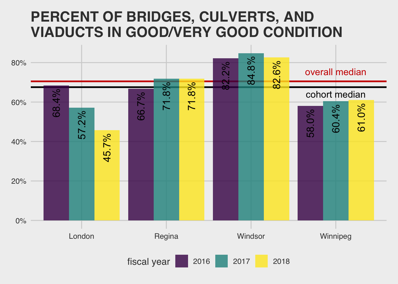
Assuming we keep a similar standard for non-road infrastructure, things really start to look dire:
a detour to infrastructure planning
Okay, so if we are arguably pretty efficient over at Public Works and we spend most of our money there, why are we coming up short at budget (forcing major service cuts over the next four years)? I think a look at another measure in MBNC gives us a clue:11
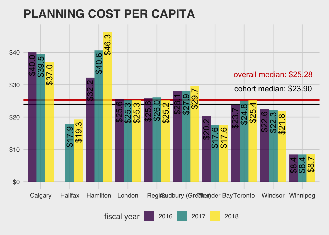
We spend less than anyone in the data on planning—we spend 36% of cohort median and 34% of overall median! But, planning is maybe the most important thing to do in a resource constrained environment.
To paraphrase some guy paraphrasing a quote from an anonymous guy12 that another guy misattributed to a famous guy:13
Given one hour to solve a life-or-death problem, I would spend 30 minutes analyzing the problem, 20 minutes planning the solution, and ten minutes executing the solution.
…this may be part of our financial issues.14 The old example of driving for 30 minutes to save 30 cents on gas comes to mind.
transit
Moving on to the second major area of City spending reveals other surprises. In this data set we narrow down to “bus only” municipalities for an apples-to-apples comparison. To get a broader picture, let’s include Hamilton in the cohort since London didn’t report (and Calgary has light rail, so isn’t comparable).
First, some use statistics. Does anyone ride the bus in this frigid tundra?:
![]()
Comparatively, … yes, as it turns out.
And, our buses actually have a pretty high per capita time on our roads comparatively:15
![]()
So then we must pay a lot for it! …
![]()
Not so much, it turns out.
Our transit system seems to be a leader in efficiency (and, on some measures, of effectiveness) among the MBNC cities. Surprise! And, it looks like there are plans to make buses more frequent, quicker, with more direct routes… Nice work Winnipeg!
influencing factors for transit
Basically none of what we’ve laid out so far tells us the whole picture, but in the case of transit, we do know a couple of other relevant facts.
First, our transit efficiency might have a bit of a back-wind in this comparison (sorry Winnipeg).
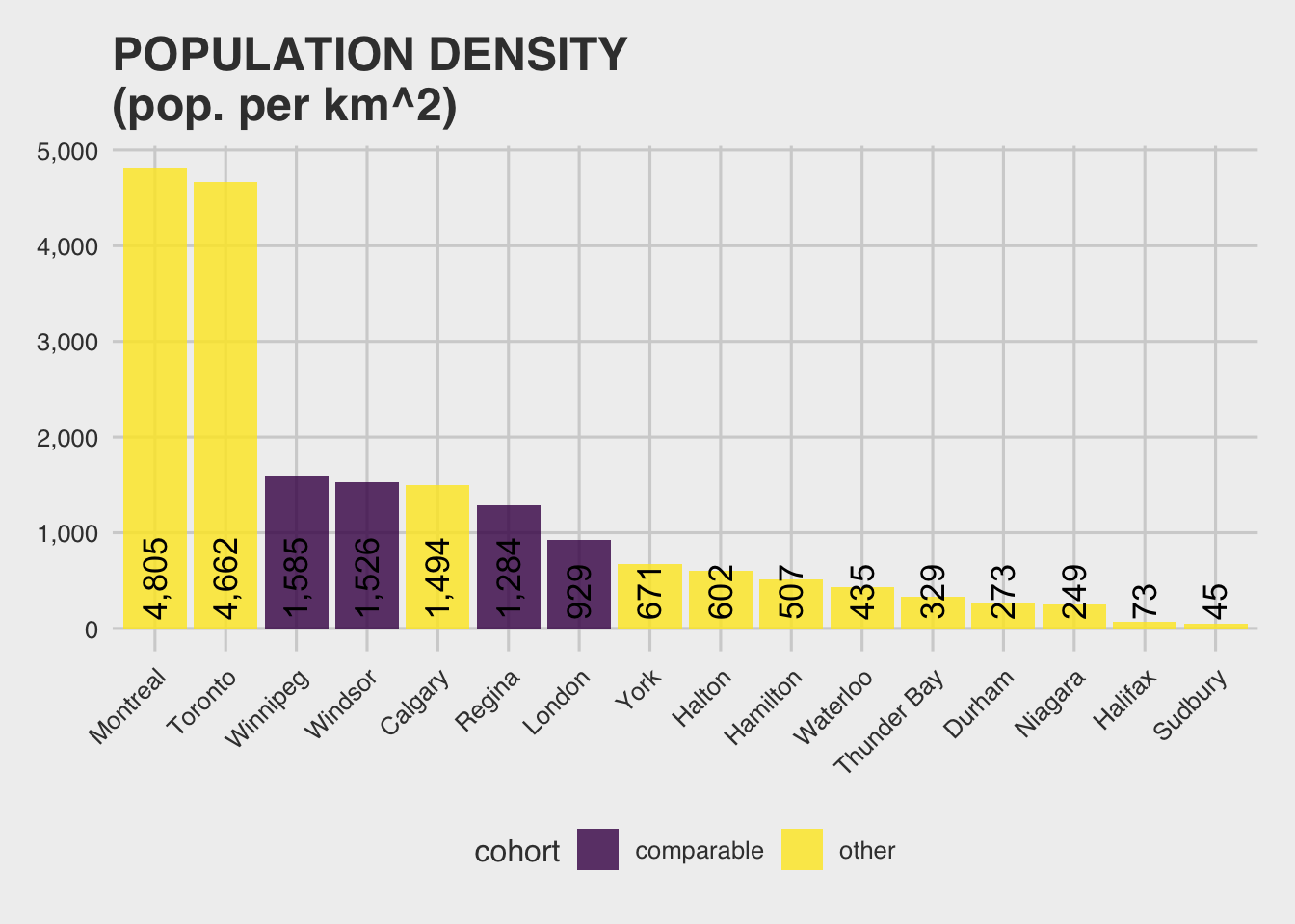
We have a higher than normal density (for the Canadian cities represented here), so our transit resources don’t need to be spread as thin:16
However, given that our geography contains rivers, rail-yards, and has an imperfect grid (to say the least), I think we are probably doing okay here.
police
Time for number 3 on the list of places we spend our money: Winnipeg Police Services.
How much do police services cost us per person?:
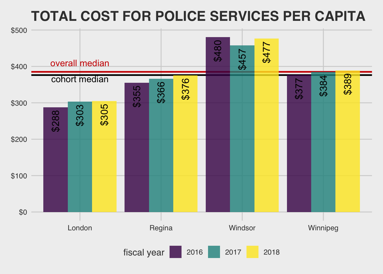
Both within cohort and outside of it, it looks like we are spending a pretty average amount per capita here.
We also have a pretty un-interesting number of police staff:
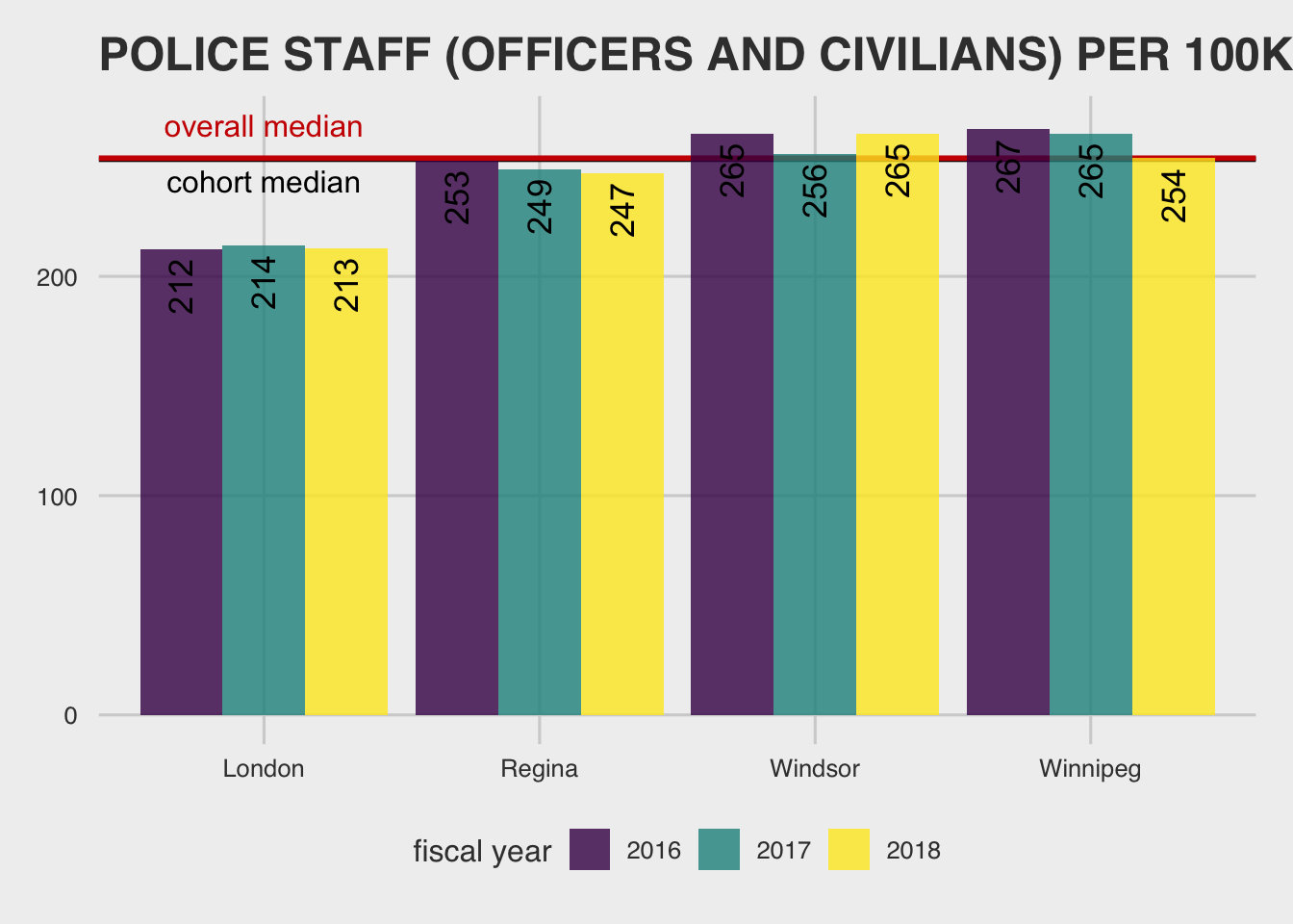
Our efficiency, is pretty standard too. We are right on or near the median for costs and resources (more than median resources, less than median cost). Not much to go on from a cost-savings/optimization point of view, so I’ll exclude it here.17
Unfortunately, our crime levels are above the median:18
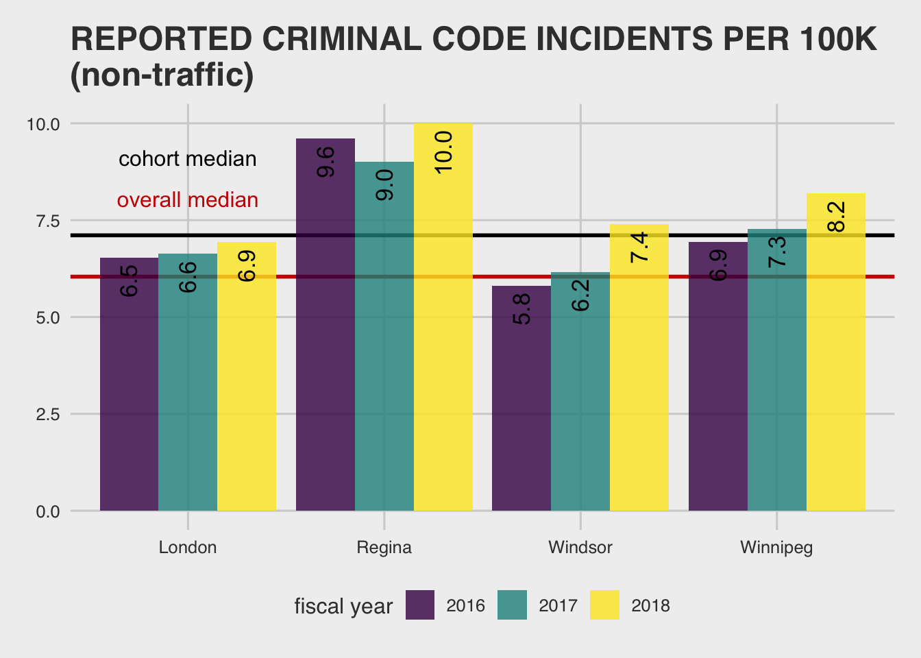
This suggests that either our crime-reducing interventions are less effective than other cites, or there is some other factor at play.
It is unclear whether this is better tackled by changes in policing or other social interventions. However, given that our police will have more incidents to respond to than other cities, it is plausible that our police force is more efficient than the total expenses/staffing would suggest.
honourable mentions—water and waste
I won’t go into all of the details here except to comment on the general infrastructure theme—we’re in trouble:
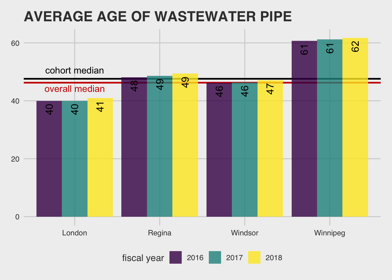 Yep, more infrastructure deficit… Also, according to the MBNC we should expect that density increases the costs to repair & replace this infrastructure (p. 233). The great news just keeps coming!
Of course, a big influencing factor of this measure is when cities expanded. If a city expanded more than another more recently, we would expect that to drive down the comparative age of pipes. In other words, we are on the hook for the repair but comparison to other cities is cloudy at best.
Summing up
Okay! I think we learned some interesting things about Winnipeg, what we care about as a city, and got to practice some “green field” data science prioritization.
We’ll finish up in the next post by developing some tools to see if where we allocate money as a city lines up with what you care about.
All of the views expressed on this blog are my own opinions, all data is openly available, and all analyses coded using reproducible research methods posted publicly.
While going through these examples, it is important to remember not all cities are created equally. MBNC does a good job at flagging how they differ on different measures, and I’ll be adding that info here. But, it’s always a good idea to ask whether there are gotchas when comparing measures compiled by different individuals, especially across differently structured orgs.↩
I won’t go through all of the detail, but basically k-means is a technique where you (i) transform all measurements to put them on a common unit scale and “plot” them in space, (ii) start with k random evaluation points in the space (often starting on points from the data set) and group each point in the data set to the nearest of these k points, (iii) move the k points to the center of its nearest points, (iv) repeat until you get a more or less stable clustering, where the data points associated with the k points stays the same, or close. For a more in-depth explanation, this guy is usually pretty good. Here is an explanatory GIF if you don’t have 5 minutes.↩
This analysis takes each point and finds it’s closest point and clusters them, then it takes the average of the attributes for those clusters and tries to find the next closest cluster, etc. It keeps iterating until you have a complete hierarchy. For a clear explanation with some of the choice-points you can make in this type of clustering using R see this datacamp article.↩
For “single-tier” municipalities↩
One thing to keep in mind here is that this depends on how distributed the central services are across municipal departments. These things are pretty central for Winnipeg, so it should be fairly conservative to compare. But, further research would be required to say for sure.↩
Maybe we’ll take a look at churn analysis in a future post.↩
For the sake of breadth of opinion, another hypothesis is that HR is really good at attracting top talent in Winnipeg, which naturally has a higher churn rate—you can hope, right? If the Winnipeg Open data portal updated it’s HR data, we could potentially dig in further. Another unexplained standout for me here that might be worth looking into is that large cities—where competition should be the highest—have been really good when it comes to keeping their employees.↩
“A lane km is defined as a kilometer-long segment of roadway that is a single lane in width. For example, a one km stretch of a standard two lane road represents two lane km.” (MNBC Performance Report), p. 183)↩
In particular, “this measure represents the total cost of all functions related to road maintenance. This includes operating costs and amortization associated with capital costs for paved and unpaved roads, bridges and culverts, traffic operations, roadside maintenance, and winter control for roadways, sidewalks, and parking lots.” (p. 184)↩
The guy over at dearwinnipeg.com would be proud!↩
As a note on the MBNC data, the Performance Report says that one influencing factor of planning cost is that “Many municipalities are undertaking growth management studies, which impact workload and cost” (p. 154).↩
This time Einstein.↩
More fodder for the DearWinnipeg guy. You’re welcome!↩
A note on hours of service: “This measure is as the annual vehicle hours operated by active revenue vehicles (buses, trains, etc.) in regular passenger revenue service including scheduled and non-scheduled service. It does not include auxiliary passenger services (e.g. school contracts, charters, crossboundary services to adjacent municipalities), deadheading, training, road tests, or maintenance. The population used in this measure is based on the service area population as reported to CUTA (Canadian Urban Transit Association).” (p. 213)↩
Tempering the dearWinnipeg point, that our sprawl is out of control… That is not to say that it isn’t, just that others have it even worse!↩
But, feel free to check at (pp. 164-175).↩
And violent crime is even a bit more pronounced!↩
Thank You!
Your comment has been submitted. It will appear on this page shortly! OKYikes, Sorry!
Error occured. Couldn't submit your comment. Please try again. Thank You! OK